My Paintings
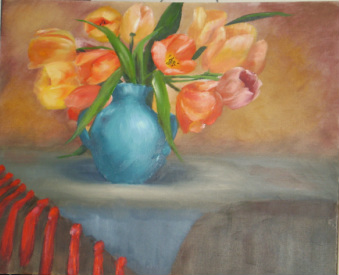
Floral table top
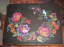
This is my first attempt at a Maureen McNaughton design. I painted this piece for my Mother-In-Law for a gift - the design is painted on the top of a fold down table.
I love the way the colours 'jump' from the table top when painted on the dark background.
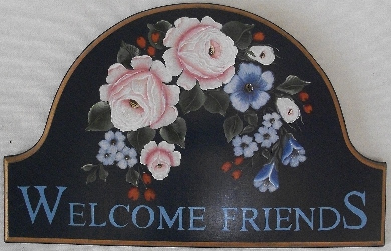
Welcome Plaque
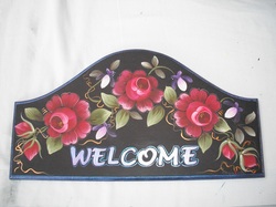
This is another Maureen McNaughton design which I painted for my Mother as a gift for her new house.
Although it is painted on mdf and it has been varnished I will wax it a few times before attaching it to the outside wall .
Although it is painted on mdf and it has been varnished I will wax it a few times before attaching it to the outside wall .
Ronnie Bringle's Noah's Ark
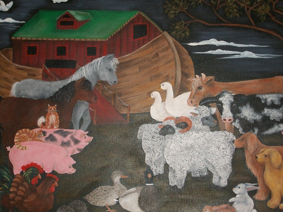
This was a painting of Ronnie Bringle's that I did as a class project. Although it started out as
Ronnie's painting I added a few extra animals. When I sent her a copy of the final picture she
said it had now become my pattern.... but it will always be Ronnie's and I thank her for the kind
words and that she allowed me to teach it also.
I really love Ronnie's style of painting and enjoyed this Noah's Ark design.
Ronnie Bringle - Country Friends
Noah's Dilemma Phone Book Caddy
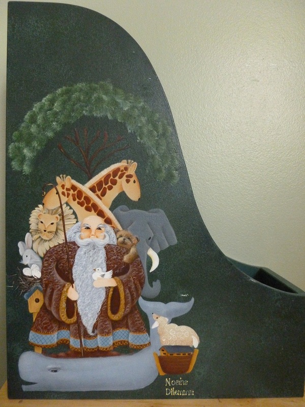
This whimsical Noah's Ark scene is the second side of the phone book caddy I painted for my DIL using a Betty Caithness design. (You can see the other side of this piece by visiting My Designs).
Betty Caithness, Artist.
This is an oil painting that I did with Joyce Thomas in the Bob Ross style using his brand of oil paints.
I thoroughly loved painting this piece and enjoy the way the oil paints move and allow the picture to be either hard or soft, blended or not.
This picture would make a beautiful Christmas Card.
I thoroughly loved painting this piece and enjoy the way the oil paints move and allow the picture to be either hard or soft, blended or not.
This picture would make a beautiful Christmas Card.
Gloria Perkins Workshop Piece
I attended a workshop with American artist Gloria Perkins, who was visiting Christchurch in 2009.
She taught us 2 pieces using oil paints.
I did enjoyed the classes but felt the colours were not quite correct for NZ; I would like to try them again with the colours we have in our atmosphere.
It was an enjoyable exercise in using oil paints and one I may pursue again.
Gloria Perkins Studio
Gloria Perkins Workshop Piece
This is the second of the two paintings I did in the workshops with Gloria Perkins.
Gloria Perkins Studio
Hanging Planter
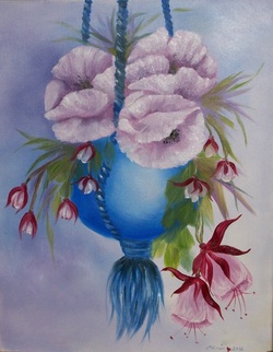
This piece was part of an oils workshop I attended. Although it was a real challenge for me, using Bob Ross oil paints, I am pleased with the result.
Australian Scenery
One of my students wanted to paint this piece from The Australian Folk & Decorative Artist magazine.
Whenever my students are painting something by another designer I try to paint alongside them so they can see how colours work and how to use their brushes to best advantage.
I painted my piece on a canvas board and was delighted with the outcome. Although I did change the original painting a little it still gives the look, I feel, of the Australian scenery.
Leap for Joy
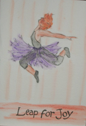
From time to time I am challenged by a worldwide group of folk art painters to join one of the exchanges they hold throughout the year. My dear friend Bonnie Lucas from Canada organizes these exchanges and always sets us a new challenge. For the last exchange we used the theme of 'Leap Year' and had to paint a card to depict the 'leap' idea. Many ladies chose frogs, dolphins etc and all these were wonderful, but I chose a dancer leaping in the air. For this card I decided to use watercolour pencils which was something different for me. I also went over parts of the dancer & her tutu with an ink pen to define edges.
These exchanges are such fun and it is always a surprise to see what our exchange partners come up with.
Thank you Bonnie for all your organization.
Tissue Box Cover
Tissue box holder - side view.
Tissue Box Cover
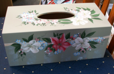
Tissue Box holder - Top & side view using my favorite background color: Vellum.
Dragon Box
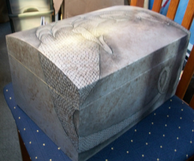
I painted this box for a friend who is crazy about dragons.
From the Australian Folk & Decorative Artists Magazine.
Dragon Box
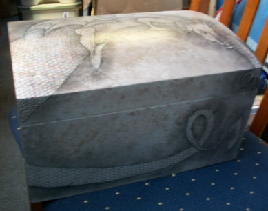
Another view of the Dragon Box - painted with Jo Sonja Iridescent colors
Unicorn
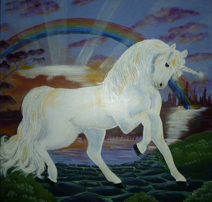
Unicorn. One of my students wanted to paint this piece from a photo she found online.
We never found who the original artist was and I would like to give him/her the glory for the original. This is my interpretation of the original. I painted this for my darling Emily to remind her to always dream of the impossible.
Summer Collage Lazy Susan
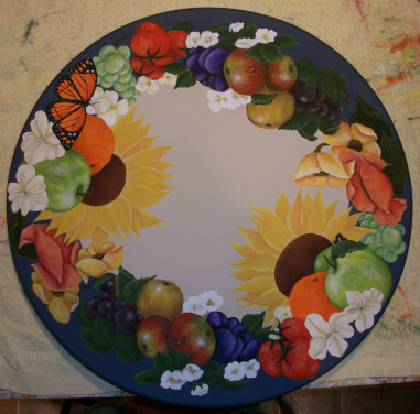
A Lazy Susan that I painted along with my class; it was a combination of a couple of designs from other tutors. A bright design for any kitchen. I added the Monarch butterfly and if you look closely you may also see some ladybirds
Happy Hen
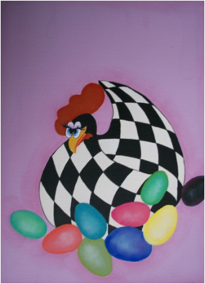
I was happy to finally discover who the original designer was for this piece.
It is such a happy piece and I have painted it on both a blue & pink backgrounds - both looking really lovely.
Rooster and The Harvest
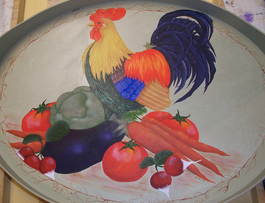
This was a piece I painted alongside one of my students.
I love painting Roosters because of the delightful colours they have in their feathers.
Again I used Vellum as the background colour & lightened it with Soft White for the centre.
Shirley Wilson's Welcome Sign
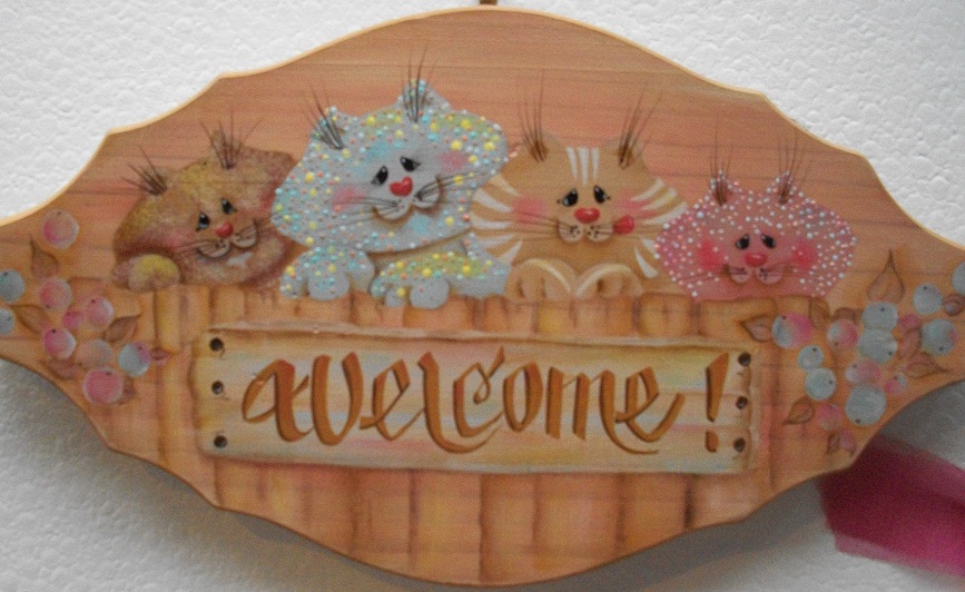
This was one of my early pieces. I painted it from a book by American Shirley Wilson.
I really love her whimsical way of painting.
Shirley Wilson - LadyBug Art Center
House Sparrows on a Clothesline
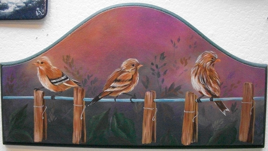
I had never painted birds before and found this quite challenging but I was glad I gave it a go.
Joanne Webber's Welcome Friends
This was a Welcome Friends plaque that I painted under instructions from Joanne Webber.
I value the classes I took with her.
Joanne Webber - Contemporary New Zealand Artist and Painter
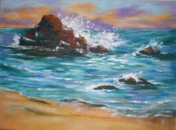
Seaside Safe Haven
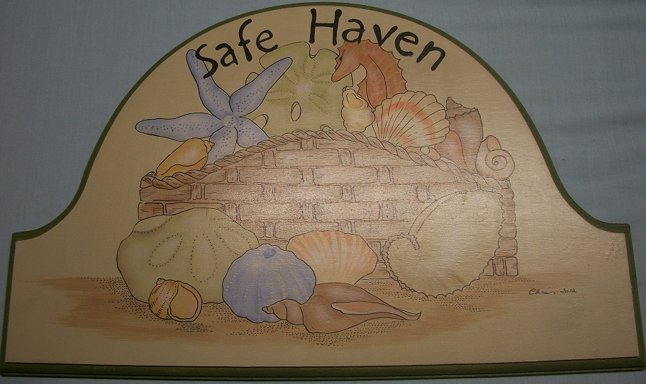
Seaside Safe Haven. This was a piece I painted for one of the girls I worked with when she left. Because Jacqui lives, like me, only 100 metres from the beach, it seemed quite appropriate to paint this design. It is from
Happy Halloween Door Plaque
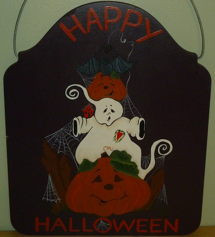
Happy Halloween Door Plaque. This ia a Jamie Mills-Price design. I love her designs and knowing my DIL, Teresa's love of Halloween this piece was a delight to paint for her. The Happy Holidays design below, is on the reverse.
Jamie Mills-Price, Artist
Happy Holidays Door Plaque
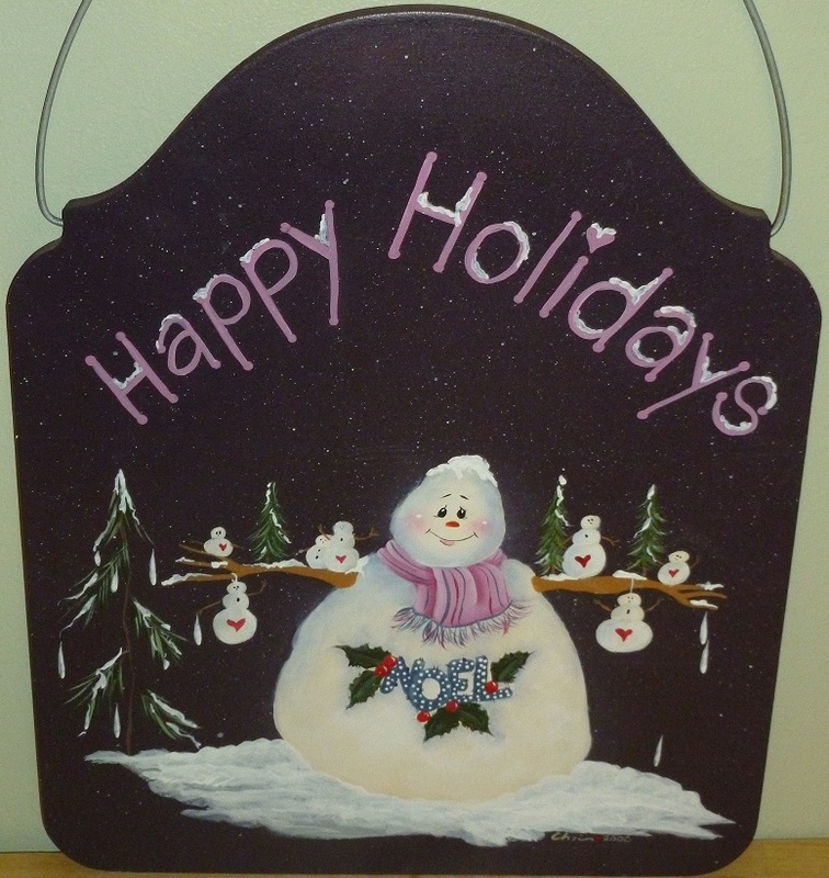
This Happy Holidays door plaque is of another Jamie Mills- Price design. They are always such fun to do. Thank you Jamie for your beautiful designs.
Jamie Mills-Price, Artist
Christmas Plaques
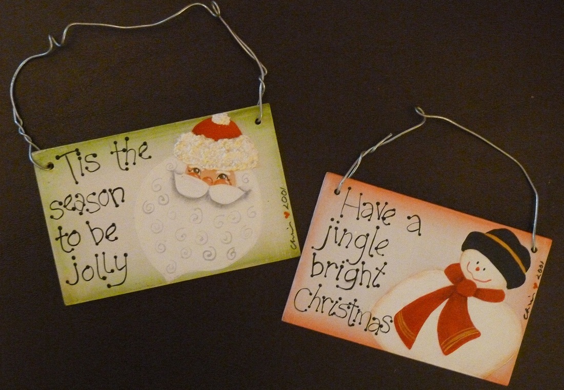
'Tis the Season' & 'Jingle Bright' Christmas Plaques. Such easy & fun little pieces to do.
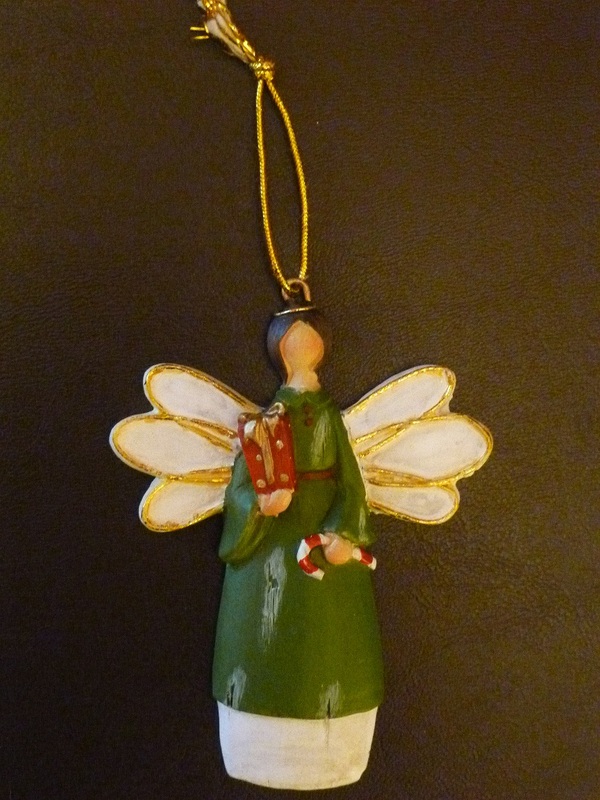
Christmas Angel Ornament
Christmas Ornaments
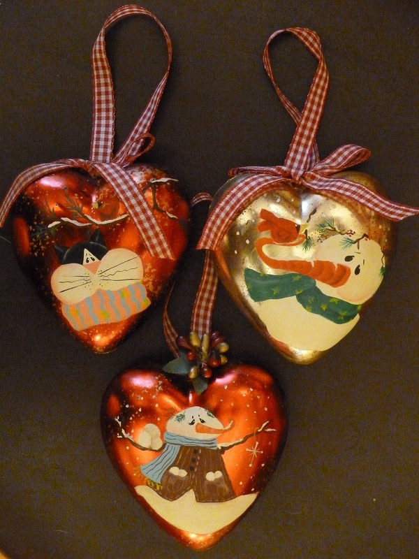
'Christmas Cat' (top left), 'Snowman & Cardinal' (top right) & 'Snowball Fight' (bottom) Christmas Ornaments. At the end of the Christmas season I love to go shopping for Christmas balls/hearts that are put out in clearance bins. I then paint them throughout the year for sale near the next Christmas. I usually have to somehow remove a pattern that s already on the pieces or somehow work it into my design.
Debbie Mitchell's Christmas Bear Tree
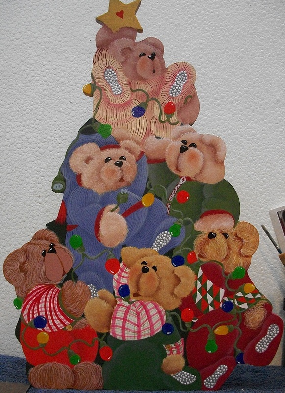
This piece was one that I had long wanted to paint; I finally did so before Christmas 2011.
I think the designer is Debbie Mitchell.
I painted a couple of these and gave them away as gifts to family for Christmas .
I love the way the bears are tumbling over each other and the lovely lights they are holding.
It took pride of place on my Christmas table last year and will now come out every year.
Debbie Mitchell - Art Is Fun!
Door Angel
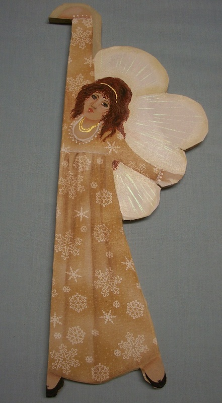
This lovely lady hangs from a door edge, watching over all who enter the room.
If you have never painted over material - give it a go. For this piece I sealed the wood with Jo Sonja All Purpose Sealer, laid the chosen material over the areas where the dress was and painted another coat of All Purpose Sealer over it. Once this was dry, I painted in the folds of the material using a deeper shade of the material & highlited where needed. Then I continued to paint the piece. I love the way you can use different materials to achieve the very pretty patterns without all the hard work of painting each little design on the fabric .
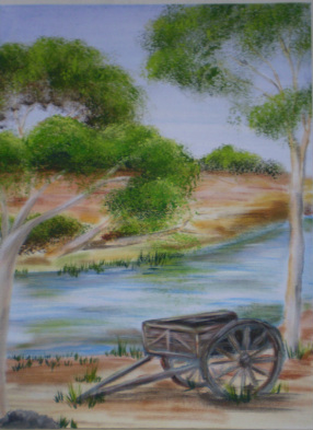
Canterbury Plains
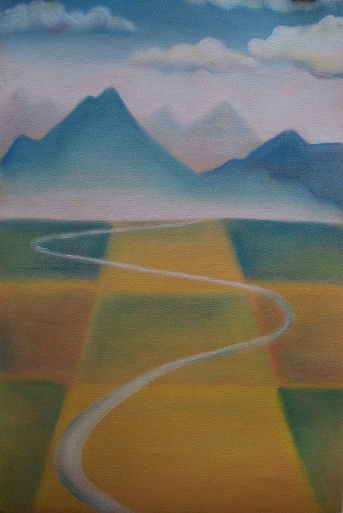
This is one of two pastels that I did with Mike Glover in 2011.
I really admire the designer's work. It is very simplistic but you know straight away that the painting is of the Canterbury countryside with the beautiful 'patchwork' effect of the Canterbury Plains leading to the Southern Alps.
Mike Glover, Artist
Marlborough Sounds
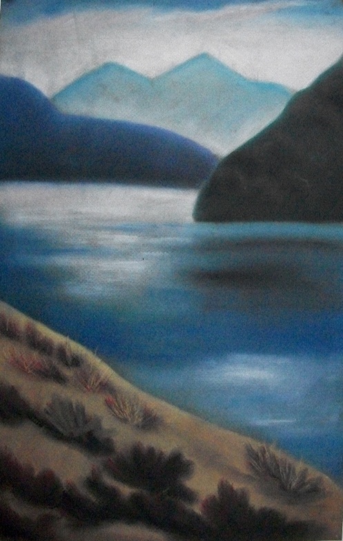
This was the second pastel painting that I did with Mike Glover as mentioned above. This one reminded me of the Marlborough Sounds. I have also used this as a base for a painting and included a kea in full flight showing the beautiful red under its wings (you can see this piece amongst My Designs).
Mike Glover, Artist
Labrador
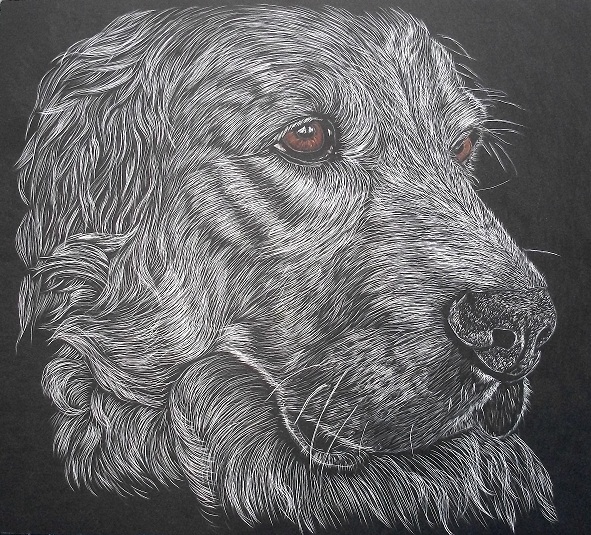
This is the first scratch art piece I have attempted. This pattern is by Judy White from Australia.
The Painting and Scratchboard Art of Judith Edwards-White
